

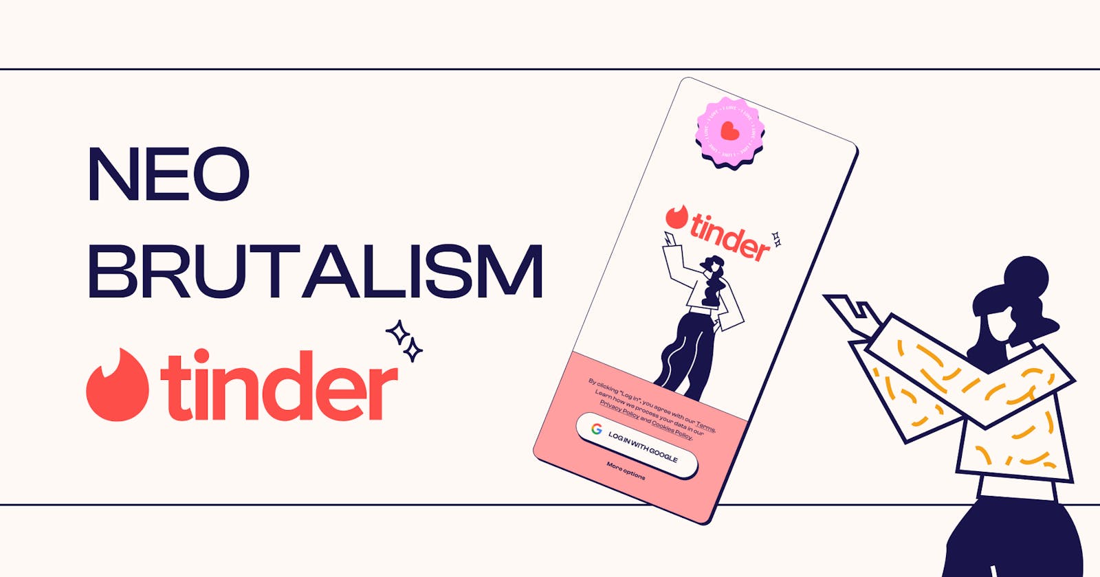
Neo-Brutalism Tinder: Design Process breakdown
How I redesigned Tinder in Neo-Brutalism style breakdown of elements and components in Figma


Before beginning this blog, it is important to mention that this is a passion project. I was eager to experiment with a new design trend that I have been familiar with for some time. In the past, I worked on a project related to Neo-Brutalism before it became a trend. Unfortunately, it was a white-labeled project, so I do not have the right to claim ownership or showcase it as one of my works. Nonetheless, the project was significant to me, as I thoroughly enjoyed working on it and was passionate about it. As a result, I made a conscious decision to refrain from accepting any more white-labeled projects.
This background explains the reason behind my interest in creating this blog and its design. In the past, I have incorporated Neo-Brutalism into a few personal projects, but I never finished or published them. However, I have since matured and grown as a designer, and I have created something more refined, polished, and complete.
Now, let's delve into the actual project.
What is "Neo-Brutalism"?
TLDR
"Neo-Brutalism" is a design style trend that emerged as a reaction to the polished and sleek aesthetic of the dominant flat design movement. It is characterized by a raw and rough design language that emphasizes the use of bold typography, vivid colors, and unrefined visuals.
Origin of the term
The term "neo-brutalism" is inspired by the architectural movement of the same name that emerged in the 1950s and 1960s. The movement was known for its use of raw and exposed materials such as concrete, steel, and brick, and its rejection of decorative elements.
Design Philosophy
In the realm of UI/UX design, neo-brutalism emphasizes a focus on function over form and often eschews traditional design principles like grid systems and symmetry. It is a style that embraces imperfection and rawness, with a DIY aesthetic that often feels handmade or amateurish.
Overall, the neo-brutalist trend represents a departure from the clean and minimalistic style that has dominated UI and UX design in recent years. Instead, it emphasizes a sense of authenticity and individuality and challenges designers to think outside the box and embrace imperfection.
Application in Products
Modern apps are applying neo-brutalism in a variety of ways, from using bold and unconventional typography to using vivid colors and patterns. Some examples of apps that embrace this style include CRED, Gumroad, and many others.
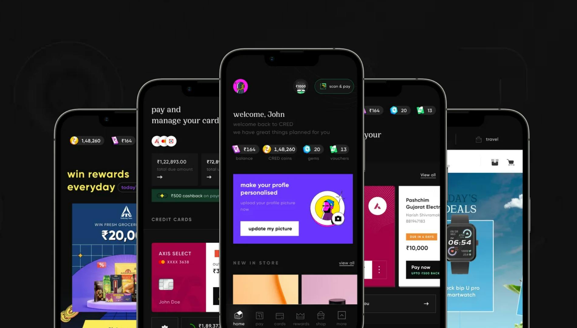
Now CRED has been able to hit the jackpot with its UI and UX. I will probably publish a detailed breakdown of the features that I like in the future.
Preprocessing
Why did I choose Tinder?
I decided to delve into the world of Tinder for a specific reason. After using the app for a while, I grew frustrated with its lackluster user interface and limited features. Moreover, despite my best efforts, I couldn't seem to land a match. But let's be real, that's not the only reason I'm here!
I spent a considerable amount of time studying both Tinder and Bumble. While I believe Bumble boasts a superior user experience, Tinder's popularity and long-standing presence in the market make it an app worth investigating. I found it fascinating how both apps use similar strategies to attract users. Tinder, for example, has expanded beyond its primary purpose by incorporating in-app advertisements, a smart way to generate revenue.
In a future article, I will delve deeper into the differences between Tinder and Bumble. For now, let's focus on the task at hand.
Mindmap
When it comes to mind mapping, I always rely on Whimsical. It's an intuitive tool that makes the process easy and straightforward. While redesigning the user interface for Tinder, I referred to the app itself to ensure accuracy and consistency.
Prerequisite
To access the necessary brand elements, such as logos, colors, and icons, I used pre-existing Tinder projects from the Figma community. Here are the links to those resources. If you find them helpful, please show your appreciation by giving them a like.
Design Process
Let's get started
To ensure simplicity, I have opted for the most commonly used screen sizes, such as the iPhone 13 or 14, with a 4-column grid, 24 px margins, and 20 px gutters. Although the Material Design system uses pixels, and Apple HIG uses points, there is a theoretical difference. However, for the sake of simplicity, let's continue with these measurements.
Colors
When starting a project, it's always wise to create reusable styles of the color palette in Figma. This approach avoids confusion and makes it easier to maintain and update colors while building your design. It's also beneficial for developers, as they can build it once and reuse it in production, and any changes in the future can easily get reflected in the design as well as in the production. I used pastel colors for this project, which is a departure from the typical bright and bold colors often associated with dating apps. The pastel colors create a sense of calmness and tranquility that is often missing in dating apps.
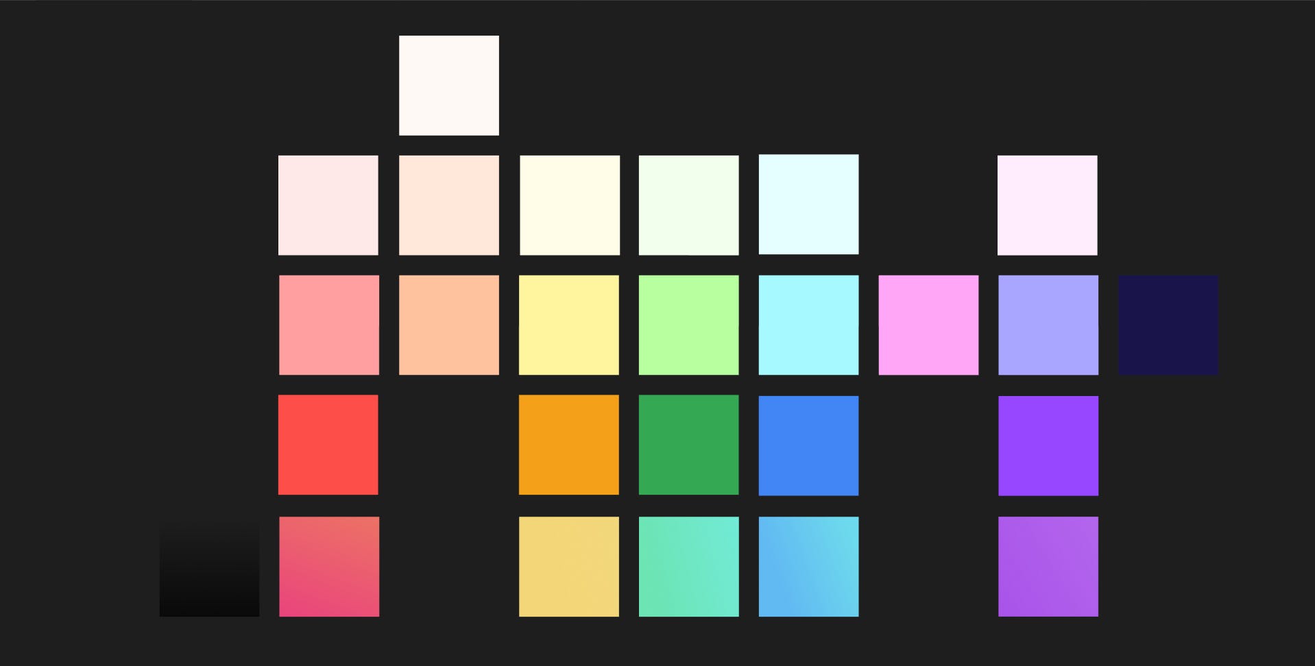
You may argue that Neo-Brutalism is supposed to have poppy colors. However, the "pop" of the colors comes from contrast. Thus, you can choose to use pastel shades and still make your design pop.
Typography
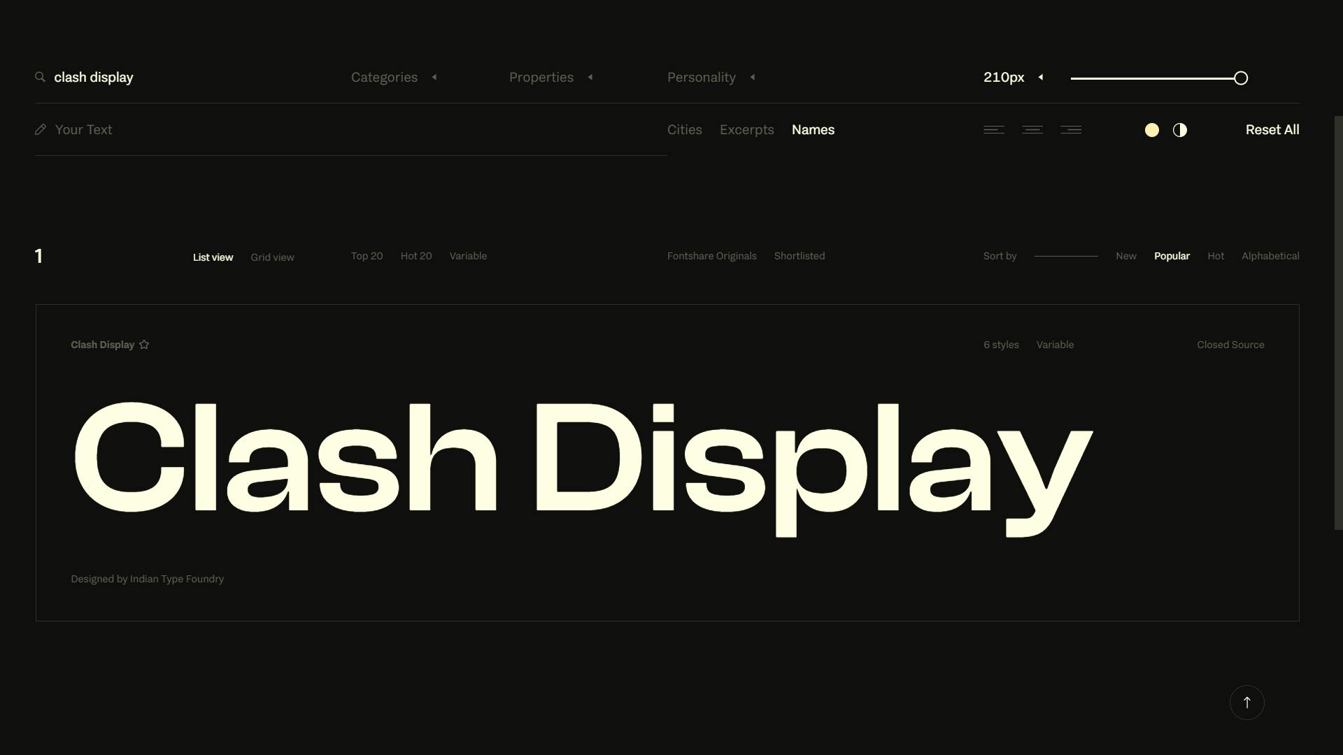
Setting up typography is one of the most laborious tasks of a design project. For any project, I typically refer to either the Material Design or Tailwind typography guidelines, as they provide a good starting point. For this project, I chose to use the "Clash Display" font family with Material Design typography guidelines, extending it by adding different font weights for the same sizes.
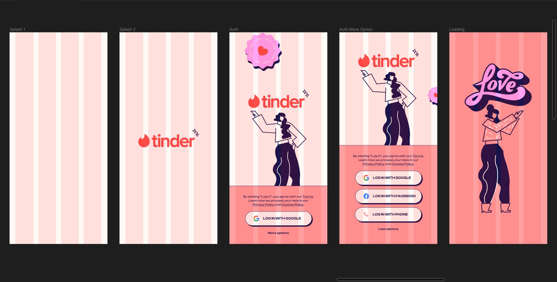
The Splash Screen
The splash screen is the only part of the project that is purely a result of creativity and playfulness. No old UI, UX flow, or guidelines are followed. I played with whatever I thought looked suitable. Following that is the authentication screen, which marks the beginning of the process of building the elements.
Buttons
In this app, every button has three states, which are Default, Hover, and Pressed. Although the Hover state may not be necessary for mobile, there are instances where hovering on the button is required. Therefore, to ensure future-proofing, I have implemented the Hover state, as I also have a SaaS version of the app, where I may need this state
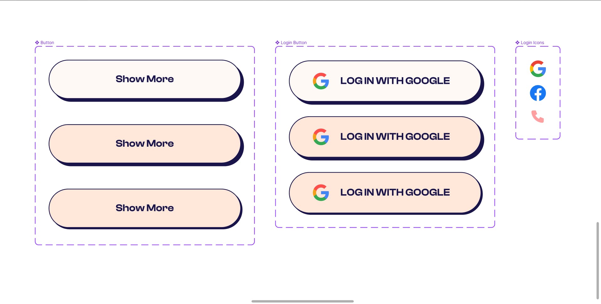
Login Button
To make the login button component more versatile, I created a component that includes icons for all three login methods and added it to the login button component. This approach allows us to easily replace existing icons with new ones if any new login methods are added or removed in the future.
Primary Button
For the primary button, I used the same button component as the login button but removed the logo since none of the primary buttons in the app have an icon. The button only has text.
Action Icons
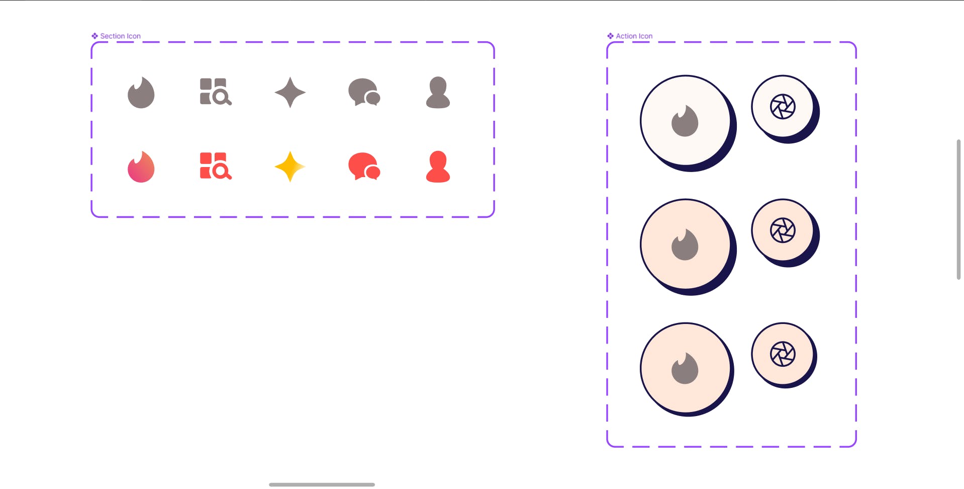
What is an action icon?
A button element that only has an icon as content, no text. I learned this term from Mantine.js (I'm a zod Mantine user and love their design system)
As action icons are just different variations of buttons, I followed the same rule of having three states, only this time the padding-x and padding-y are the same. I made two size variations of the action icon, as in many places smaller action icons are also needed.
To create general-purpose UI icons, I used the Phosphor Icon library, which blends well with the Neo-brutalist design of the app. For Tinder-specific icons, I used the same component system as before.
Tinder Action Icons
Now, while building tinder-specific action icons, I discovered that there are 2 more categories in it.
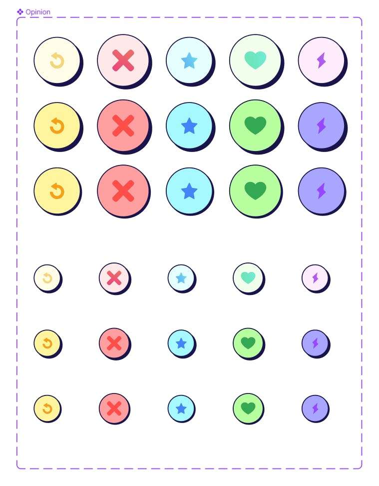
The Navigation bar (according to material design naming convention)
The options (like, dislike etc.)
Both are similar but slightly different.
For the navigation bar, I didn't have to make much while building UI. I just made the color different to denote an active tab, and that's it. But, for the options menu, I created a whole new I component set named "Option" as all 3 states of it change color according to the icons that I am pressing.
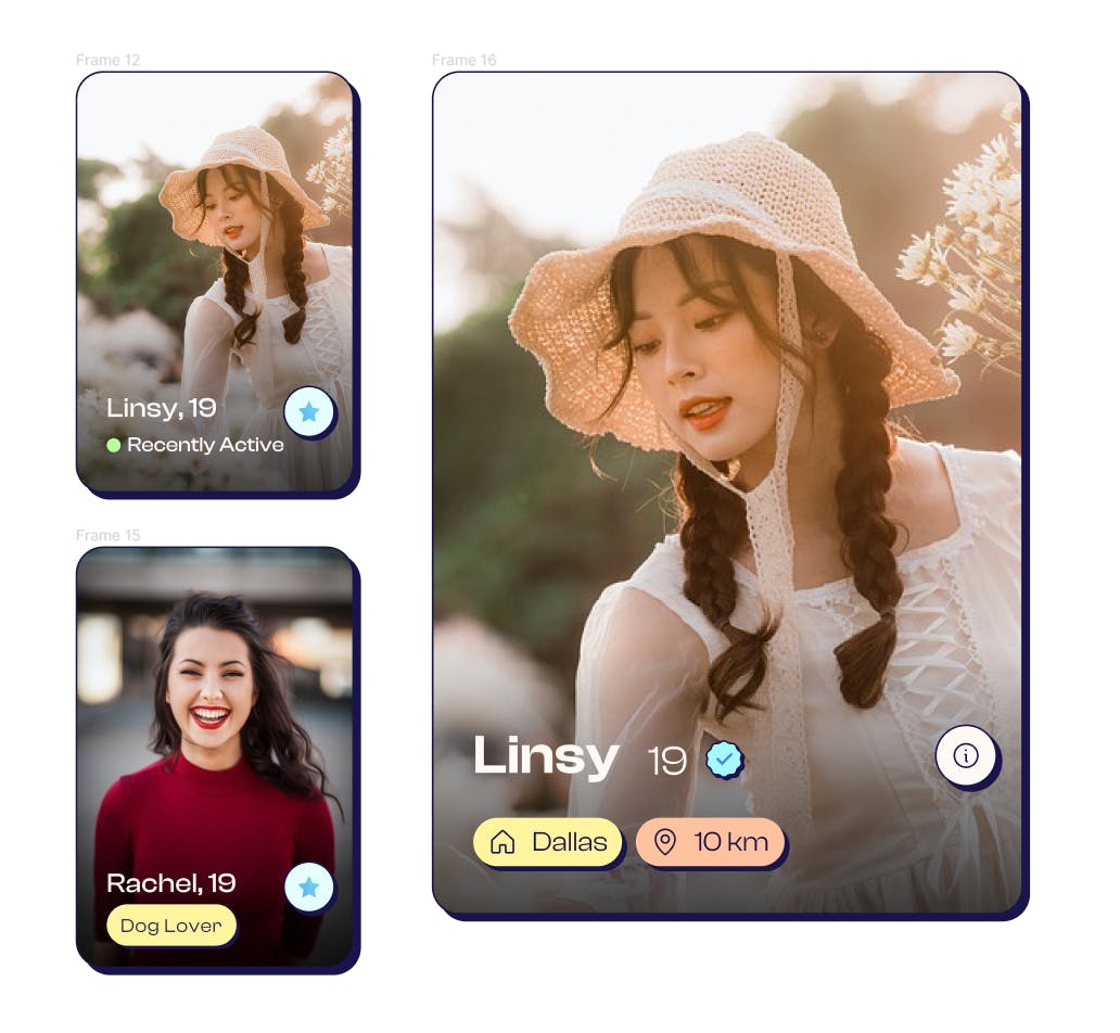
Chip or Badge
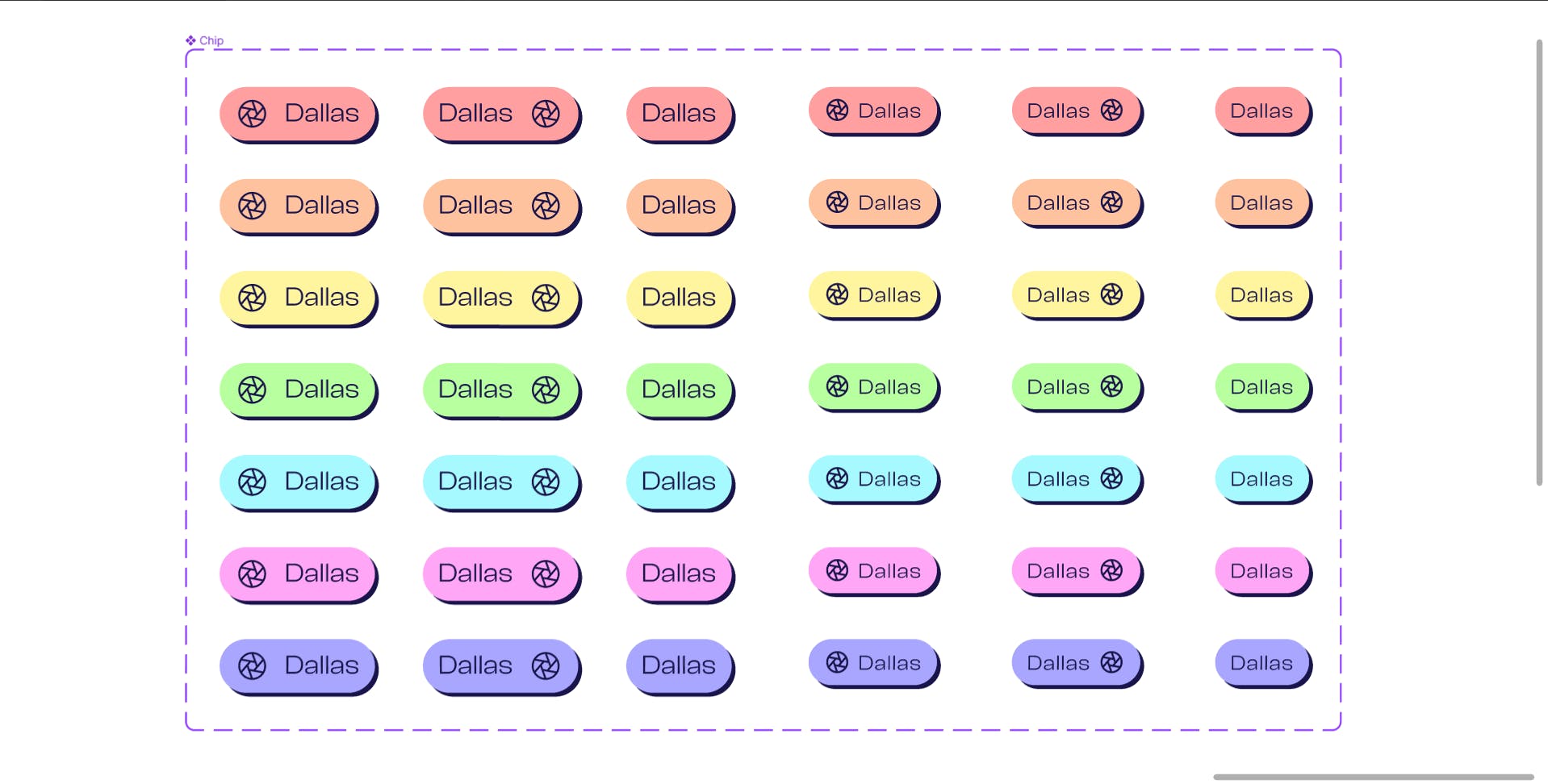
Recently, I have observed that Tinder has been incorporating chips extensively in its design. As an experienced designer, I have developed a similar component, consisting of several elements, that I believe is very effective in organizing and presenting information in a concise and reusable way.
From a data management perspective, badges or chips are excellent tools for tokenizing information. They are versatile components that can be utilized repeatedly in different contexts to represent smaller, frequently used attributes.
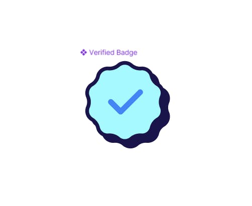
Verified Badge
One specific example of a badge is the "verified" badge, which serves a singular purpose - to indicate a verified profile. This badge is purely for display purposes and does not have any state-changing or interactive features. Similar to a theme icon in Mantine.js, this badge is a visual indicator that adds an extra layer of trust and credibility to the profile.
Let's start plating
Now that I have our elements, let's arrange them to make our main screens.
Navigation

As previously discussed, let's arrange the action icons to create the primary navigation bar with highlights on the active tab in red, as we previously agreed. I have also included this in the prototype, allowing us to experiment with it.
Cards
Preparing cards for different screens and different states
Conclusion
This concludes our current progress. I will continue to update this blog as the project develops further. You can find the Behance project related to this blog here -